OVERVIEW
As a new team took over on the client side, they wanted to see their site content updated, but also take the opportunity to add functionality that they had seen used effectively by their peers/competitors.

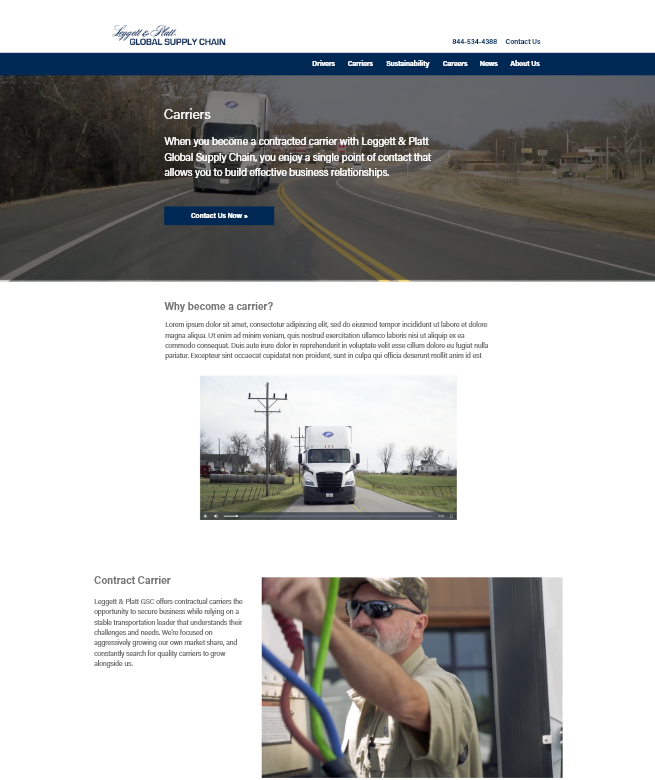
The site before redesign
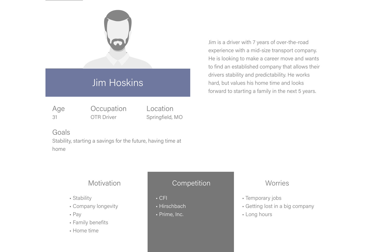
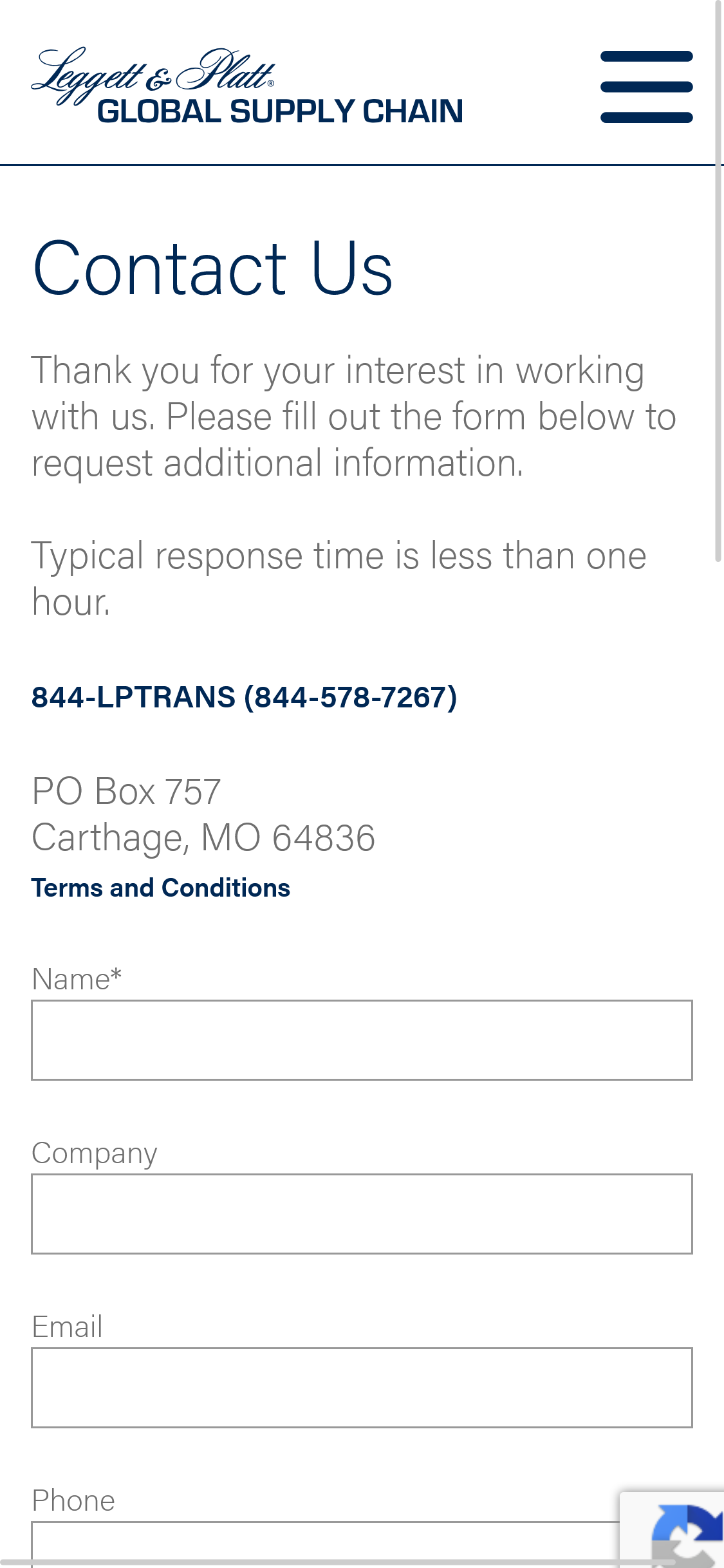
One of the personas created for the project.
MY ROLE
I was the sole visual designer and visual UX designer, and worked with the UX developer along with an Agile team of two back-end developers and a project manager under the supervision of our web team manager. I was responsible for the visual direction of the site, branding, producing any assets needed, and working with the development team on synthesis. I worked with our project manager in communicating directly with the client.
COMING TO A SOLUTION
In doing research on competitor sites, I saw not only the features that were requested from the client, but also several other features that could bring their site up to match and exceed their peers. We discussed these features with the client, who provided information on how best to adapt these ideas to their goals and sourced or created assets to complement the new copy and features.

An example from a competitor of casual voice copy vs bullet points.
THE SOLVE
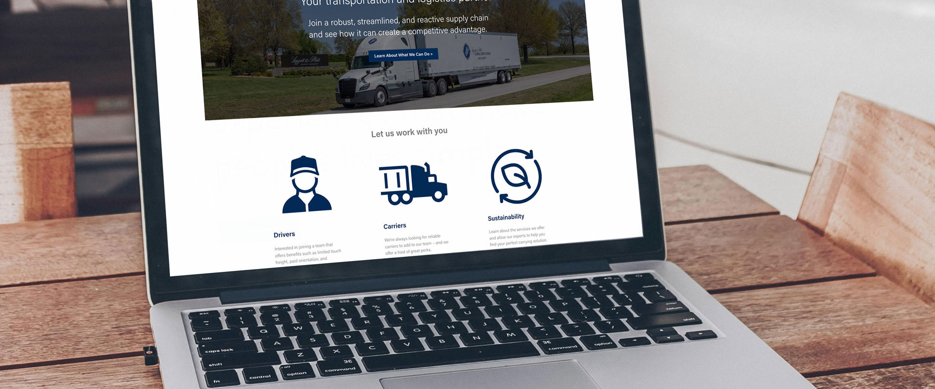
The client expressed to us that drivers were seemingly not being enticed to apply or request information, despite things like benefits and pay being comparable to peer sites. Our solution enhanced the visual appeal of the site with better imagery and additional videos featuring things like testimonials and interviews. We added copy that was more conversational and descriptive in place of bulleted lists. We also reorganized the categories of the site to better reflect the client’s revised hierarchy of informational priority.
CHALLENGES
The initial challenge we faced was a dearth of content and assets. We worked with the client to schedule photo and video shoots, as well as working with a copywriting team to produce more robust and focused copy. Secondarily, one of the main requests from the client was to increase visual interest, which we needed to accomplish while still maintaining the Leggett & Platt corporate brand standards, which restricted things like font and color usage.
THE EFFECTS
Though the site is still very fresh and we won’t be able to see meaningful analytics for some time, the client was very satisfied with the new look and feel of the site, as well as our solutions to their requests. Their site functionality now is on par or better than their peers, and set up to expand as needed iteratively.
LESSONS
Through our client interactions with this project, I learned to challenge the push by the client to prioritize a visual facelift. When we discussed the actual issues at work, it became clear that the issue went deeper than refreshing images or color choices and became more about rethinking the site structure and functionality.